You don’t have time to waste when you use a mobile app for work. You need it to be accessible and well usable. Adela Kovarova, a UX researcher at Resco, explains how we address our users’ needs, from the initial research interviews to the implementation stage.
At Resco, our focus is on providing software solutions for frontline workers. Can you explain why UI/UX is important for them?
Frontline workers operate in the field without the convenience of a fully equipped office. They are constantly on the move and often under time pressure. These people need to concentrate on delivering high-quality work they are experts at.
We don’t want to burden them with complicated work apps. Our goal is to make them intuitive.
The Resco Mobile App Development Toolkit works very well from a technical point of view. We have a top-notch offline mode and customizable synchronization. We strive to make all of this as user-friendly as possible for frontline workers.
Why is usability so crucial?
When an app is usable, it is easy for the workers to figure it out. They don’t require extensive training or support.

Using their work app should leave them satisfied and self-confident. They shouldn’t feel frustrated, as that could negatively impact their interactions with customers.
How does the UX/UI of mobile apps differ from desktop apps?
Mobile devices are ubiquitous. People rely on them as their primary devices for accomplishing tasks. For deskless workers, they are clearly the most practical devices in the field. They can’t imagine running around and doing their job with any other device.
My colleagues who worked at Resco two decades ago foresaw this trend and couldn’t ignore it. They adapted desktop applications for use on mobile devices. Supporting frontline workers is not new to us.
Thanks to our extensive experience, we know that mobile applications have different standards compared to desktop apps. Most importantly, mobile apps require users to navigate efficiently and quickly, even with gestures. With larger screen space, desktops can display more information. Mobile app interfaces often prioritize essential information and use responsive design techniques. Mobile apps are typically designed to adhere to specific platform UI guidelines and conventions, ensuring consistency with other native apps on the platform and providing a familiar user experience.
How does this translate to the user interfaces of mobile devices?
Let’s emphasize the usability concept once again: making the apps user-friendly is crucial so that anyone can work with them.
When discussing field service, our users work in challenging conditions. They often wear gloves or work in harsh sunlight. Therefore, the apps need high contrast, large touch targets, and so on. Workers should not struggle to tap exactly where they intend to. They need to have their apps in their hands and have complete control over gestures that help them accomplish their tasks.
Speed is paramount in the field. Everything must be designed to allow workers to operate their apps quickly.
Resco has been in the market for 24 years. During this time, user interfaces and the entire experience of using technology have evolved. How do user requirements change?
Users want their apps to be as simple as possible. In the past, there was a focus on creating visually appealing interfaces with shadows and gradients. However, nowadays, fewer people prioritize aesthetics. The primary expectation is for apps to be easy to navigate.
Users dislike visual clutter and information overload. They want to see only the necessary information on the screen in a specific situation, and they want to see it immediately.
Additionally, users prefer having everything in one place, so they don’t have to use multiple apps. That’s why they can take pictures directly in Inspections+, use a QR scanner, or write notes.
When field users encounter a problem, they want to avoid calling colleagues or rummaging through Sharepoint. They can access Steps+, which provide all the necessary documentation directly from their apps.
You work as a UX researcher. How do you get to know the user’s needs?
To be honest, UX research is quite challenging in B2B.
While reaching people who use desktop tools is relatively easy and allows for direct implementation of their requirements, reaching mobile users is more complex. Typically, there are implementation partners and managers involved. However, this research is highly valuable as the ultimate goal for a UI/UX researcher at Resco is to see frontline workers using the application.
Apps created with the Mobile App Development Toolkit cover many scenarios. They are not single-purpose apps that everyone uses more or less equally – like social networks. With each case being unique, user requirements are very diverse. It’s fascinating to us.

We try to cover as many scenarios as possible in our research. On top of it, we are always thankful for customer feedback. If you communicate with your frontline users, everything they say is relevant to us. It is the most valuable feedback we can get. If you want to share it directly with me, you can reach me at adela.kovarova@resco.net
Most importantly, all our users are united by the fact that they want to work quickly and simply. We try to follow that.
What are the methods of UX research in Resco?
We ask a lot of questions. We perform user interviews, either exploratory or focused on a specific topic. Before we even get to the topic of Resco, we ask our users about their work, their scenarios, division of tasks.
We ask them what they want to achieve with our tools, what they enable them to do, and what we can improve.
These are not feedback loops but rather deep conversations about how they feel when they use our app, how they relate to it, or whether they are comfortable with it.
We also interview the admins that use our web tools to build and customize apps for frontline workers.
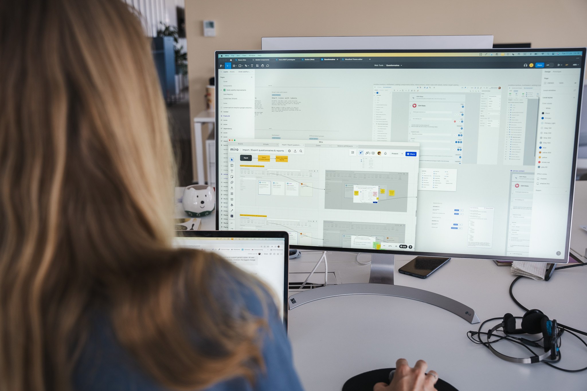
When we have new ideas for improving our applications, a UI designer and a UX designer develop a prototype. It all starts with a wireframe. UX design takes place in the Miro application, and UI design in Figma. We play with how everything should look so the design is consistent with everything we offer. We are striving to make everything look as simple and standard as possible.

We cooperate with the developers early in the UX design phase. We must ensure all the features we creatively design fit into our code and the data model.
Throughout the whole process, we are in touch with product managers. They are in charge of the product on a broader scale and evaluate the impact of the new features.
Then we test our prototype for usability. Basically, we watch how people react to it. During usability tests, we don’t ask questions. We observe users as they perform tasks and record their immediate reactions. We want to see how the prototype is worked with, where there are pain points, and if we can improve the prototype immediately in the next iteration.

After the usability testing, the features are coded and offered for preview. With our new release cycle, we have a preview each month. We encourage everyone to try it right away and give us immediate feedback.
The partner or customer must know what was done and how they can set it up. We provide documentation on our wiki.
What have you been working on recently? Is there anything you are especially proud of? Why is it important for the users?
We are redesigning forms. You can imagine a form as a detail of one record: for example, a screen with the name of the company and all the details about it.
Forms are an app component that every user works with every day. We analyzed how they are currently coded and how they should look according to the design system. We are making them more straightforward to interact with.

I would also like to point out our work on data mapping. Data mapping gives field workers, managers, and consultants an easy way to update existing records in a database directly from a questionnaire. They can also create new records or populate their questionnaires with data from the database. The update makes it easy to set up data mapping without coding using a simple wizard. A big part was released in January, and soon we will release more.
What else are you up to? Are there any exciting projects in your pipeline that you can already share?
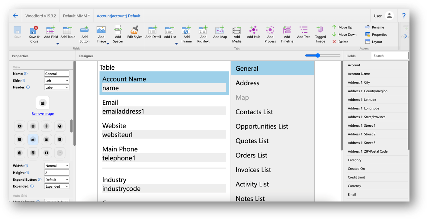
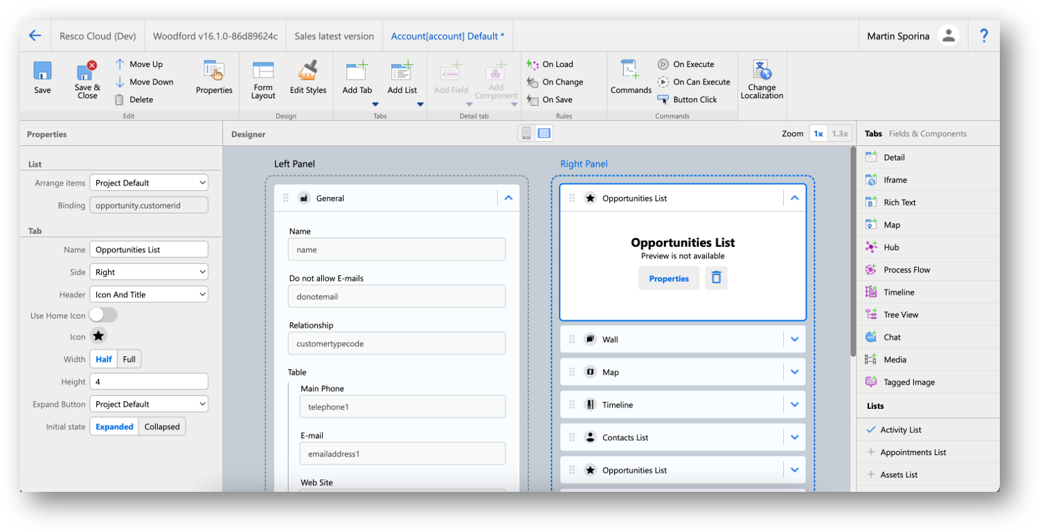
I mentioned redesigning the forms. Admin users put the forms together in Woodford’s Form Designer, which has already got a significant UX change, and we plan to continue it. We want the people designing forms to do as little work as possible. We want to come up with useful defaults. And when the designers decide to change something, they will know exactly what they are changing in the application to prevent them from accidentally setting things they do not want. Also, there is a rather big conceptual switch between how we looked at the Style editor until now and what it will enable in the future.


One area we are focusing on is the color in the Theme editor. Until now, users could set any colors they wanted. They could have accidentally produced a colorful app that didn’t follow accessibility standards.
Of course, we want to accommodate customers who have their branding colors. They can choose one color, and we will recolor the entire app for them.
With this change comes the possibility of having a dark mode.
What are the trends in the UI/UX industry that shape your priorities?
We are implementing Material Design. It is an open-source design system from Google that standardizes every single component in mobile applications. As I see it, even Microsoft’s design system is largely influenced by Material Design.
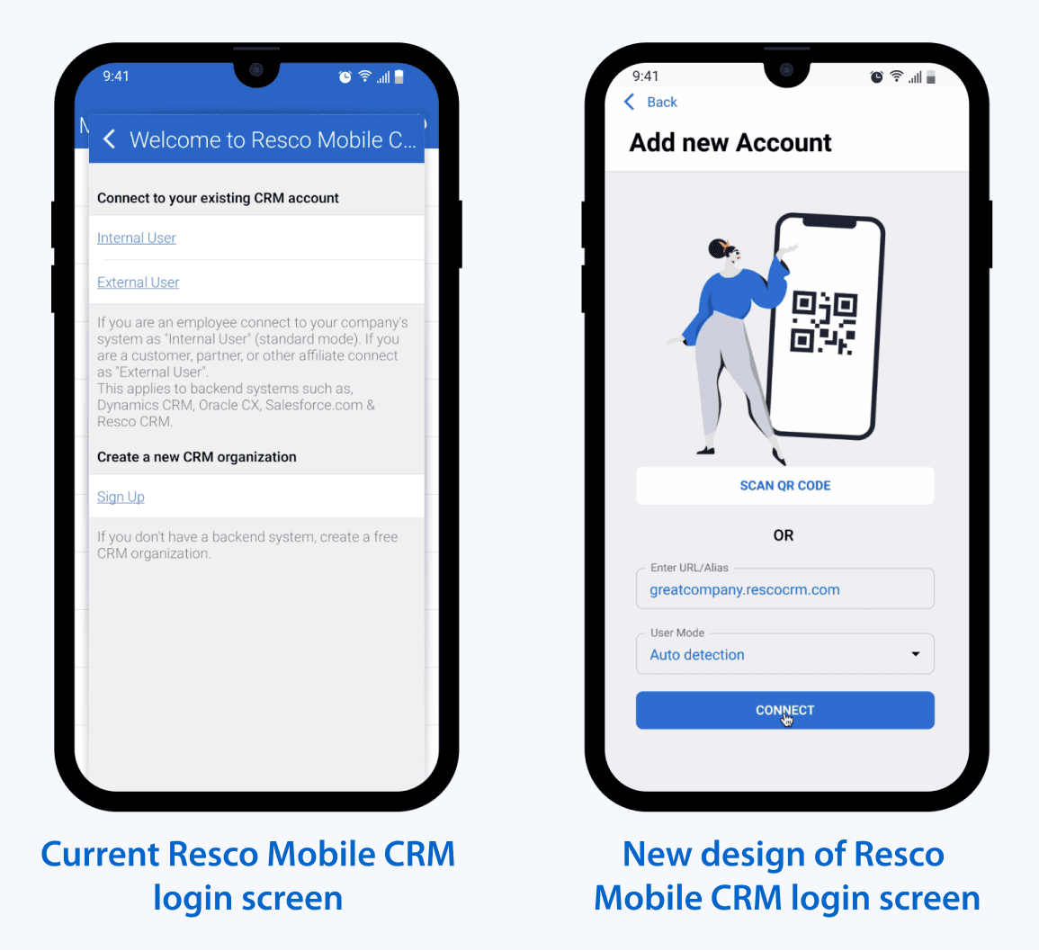
We want the users that come into contact with our apps to experience the least possible shock.
We are also influenced by trends in features. AI is a big trend; of course, it is starting to be addressed in customer feature requests. We already took part in implementing AI in creating work instructions and automating inspection summaries, and there is more to come.
Discover the Mobile App Development Toolkit